Nudge AI is an AI co-pilot that automates the note taking process during appointments for health clinicians. This co-pilot has the ability to format the notes utilizing note-taking frameworks common within the healthcare sector- such as SOAP notes. This feature significantly reduces time and energy clinicians spend on collecting and organizing notes, and allows them to focus more on treatment plans and progress of their patients, significantly improving their quality of work.
Objective
To improve the usability of Nudge AI’s notes session screen through focusing on redesigning the information architecture of this page.
The Designs
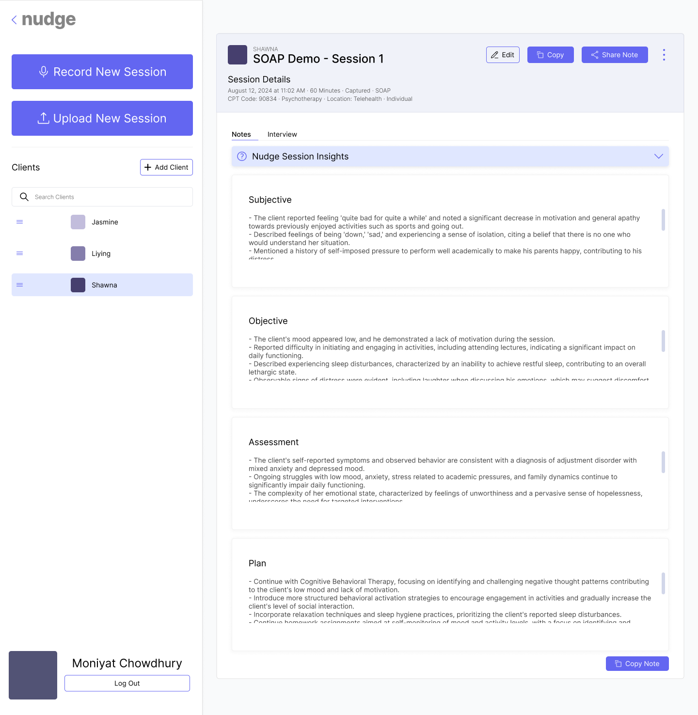
Before
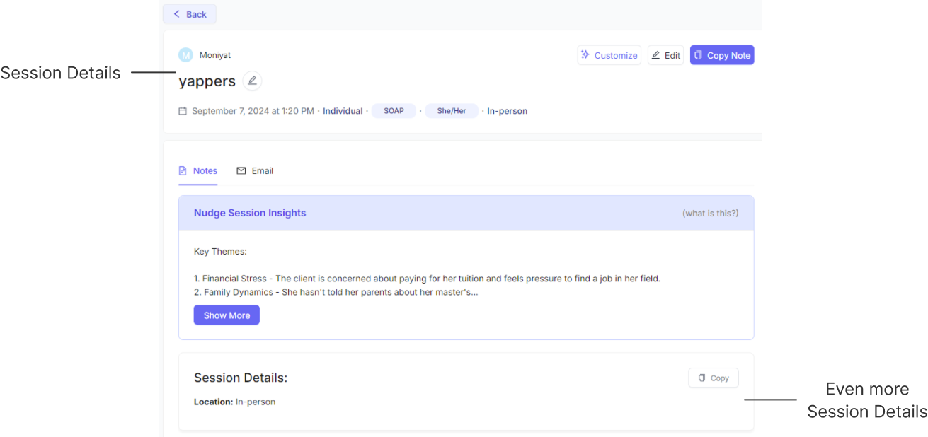
After (My Design)
User Research & Initial Findings
Dr. Liying Wang is an associate professor at Florida State University who is a PhD holder in clinical psychology. I conducted an interview where I asked about her experience of using Nudge AI in her practice. The major points of her feedback were:
The Nudge Session Insights isn’t necessary to her.
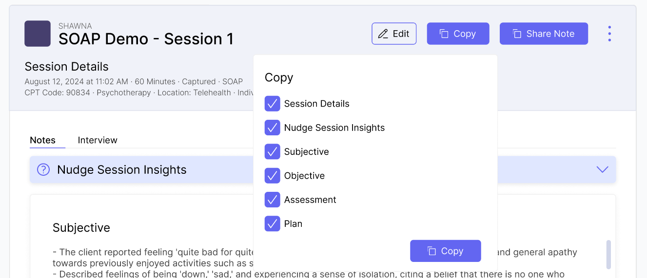
Being able to copy the entire note is not accessible.
The main focal point of this page is the notes. However, paired with Dr. Wang's feedback and my own experience of using the platform, the current architecture of the page detracts from the user's experience as it doesn't prioritize this focal point, lessening the page's usability. Therefore, the page’s information architecture should be restructured to better prioritize the notes, enhancing both usability and accessibility.
Addressing Extra Content
Challenges
There is a lot of extra information for the user to go through before they can see the notes. The main focus of the page was the notes generated from the interview. However, in the original design, there is a lot of extra information for the user to go through before they can see the notes.
Solutions
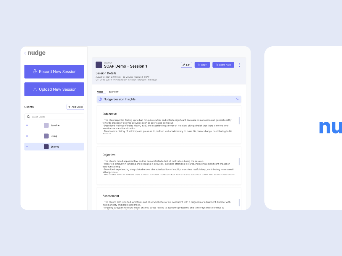
Combining related information on the page into one section In the original design, there two seperate sections showing different session details.
It was unnecessary for the session location to be in a separate section, so I combined it with other key details into a unified header. This aligns with common UI practices, which place essential information at the top of the page for better visibility.
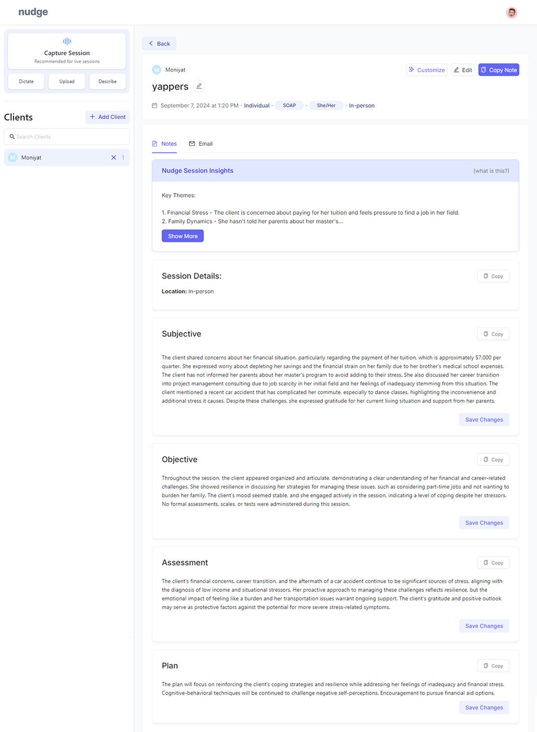
I made the session details header fixed so it remains visible while users scroll. This ensures users who skip the header to read the notes can easily reference it at any point without scrolling back up.
Minimizing Nudge Session Insights Fully “I don’t know what is going on here and why is it formatted like this?” - Dr. Wang Originally, Dr. Wang was confused by the purpose of this section and deemed it as unnecessary. While using the platform, I too, was originally confused on its purpose. Based on Dr. Wang’s feedback, I decided to fully minimize the generated session insights. Users can still access this section by expanding the section, however this design decision prioritizes the notes generated by making it more accessible towards the user.
Impact
Improved usability on the platform by prioritizing user needs By combining similar sections and minimizing extra content, users are less likely to be overwhelmed when first opening the page. Additionally, this approach doesn't detract from the main content- overall increasing the note page's usability.
Acessible Copy Button
Challenges
The current placement of the "copy note" button isn't easy to find for users Dr. Wang’s experience highlights that the current “Copy Note” button is hard to find. Its placement at the top of the session details page doesn’t match the typical user flow, as most users skip that section to start reading the note content. As they scroll down, the button disappears from view. Although each section has its own copy button, there isn’t another “Copy Note” option at the bottom of the page, where users are most likely to decide to copy the full note.
Solution
Place a "copy note" button at the bottom This would align with the standard user flow of the page, providing a more convenient experience for the user that matches with their expectations.
Custom "copy" button on the session details header This button allows users to select which sections from the notes they would like to copy. By default, all sections will be pre-selected. Additionally, since the session details header is fixed, this button is accessible to users at all times.
Remove every section's "copy" button Since there is now a custom "copy" button in the session details header, having a "copy" button for every section is now unnecessary. This also frees up retail space within the notes page.
Impact
Increased user retention Through improving the accessibility of one of the main functionality of the page, the ability to copy the entire note, increases the user retention as it now makes their experience more convinent and addresses their needs.
Updated Side Bar Design
The unique nature of the sidebar allows it to stay consistent throughout all the pages on the platform. This makes the sidebar an important feature, as it could be used to access tools without disrupting the main content of the platform.
Challenges
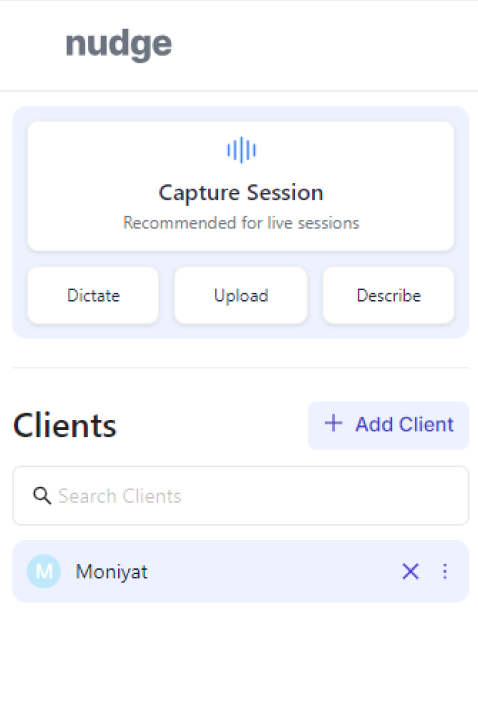
Lack of profile information on the page In the original design, there is no clear profile indicator, such as a profile picture or display name of the current logged in account. This makes it difficult for users to access their profile, decreasing the usability of the product.
Confusing format for collecting interview session The original format consists of three different ways to record an interview session. However, it is not intuitive what the different options means and the format could be improved.
Solutions
Including a profile section on the bottom of the sidebar Showcasing the profile at the bottom of the sidebar follows a common UI practice. Not only would this display important information for the user, but it woud align their expectations of how to navigate to their profile.
Simplifying the format for collecting the interview session Instead of it's original format, the format will be reduced to two buttons of the most common ways to record the interview session. I included record new session, as in record the audio/video of the session, and upload a session, which can support different file types- including text and audio files.
Impact
Improved usability Users now have quick access to their profile and the option to log out, making information more accessible and providing an added sense of security. The clearer recording format also enhances usability by helping users easily understand how to use one of the platform’s core features.
.png)